
When most people say they need a logo, what they usually mean is they need a brand. The logo is just one part of it, and often not even the most important part. A full brand identity is the complete system of visual and verbal elements that tells the world who you are, how to recognise you and why you're worth their time.
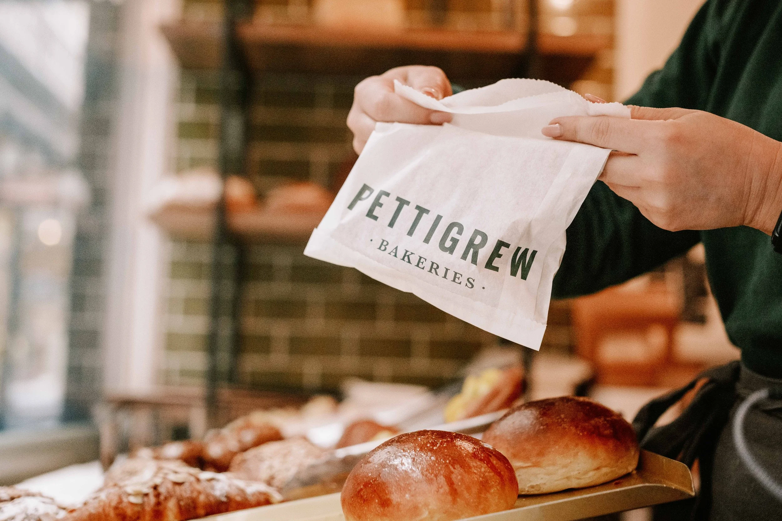

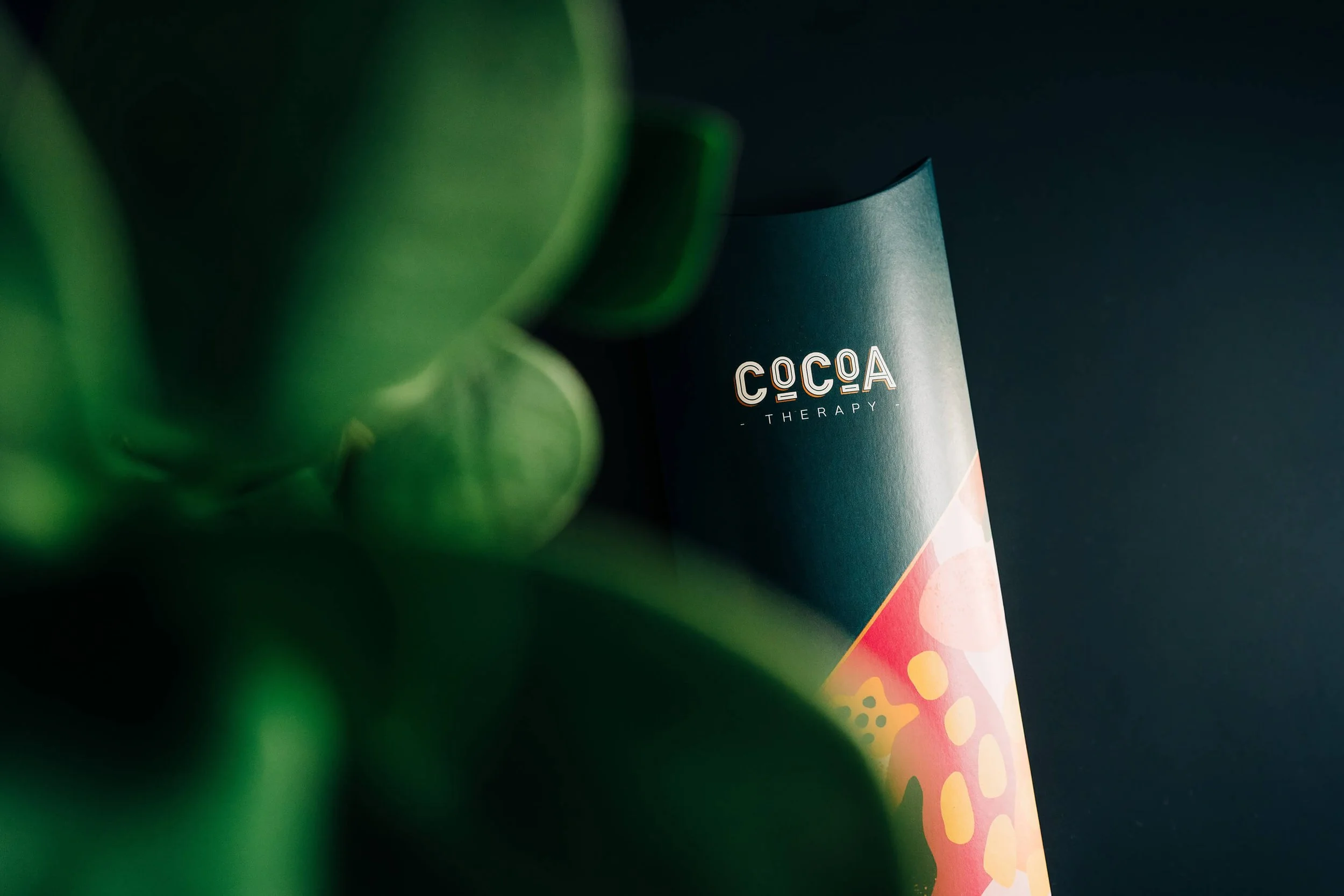
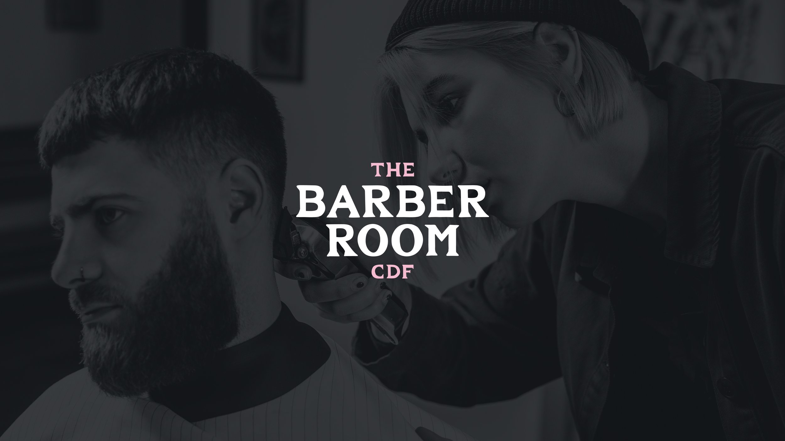
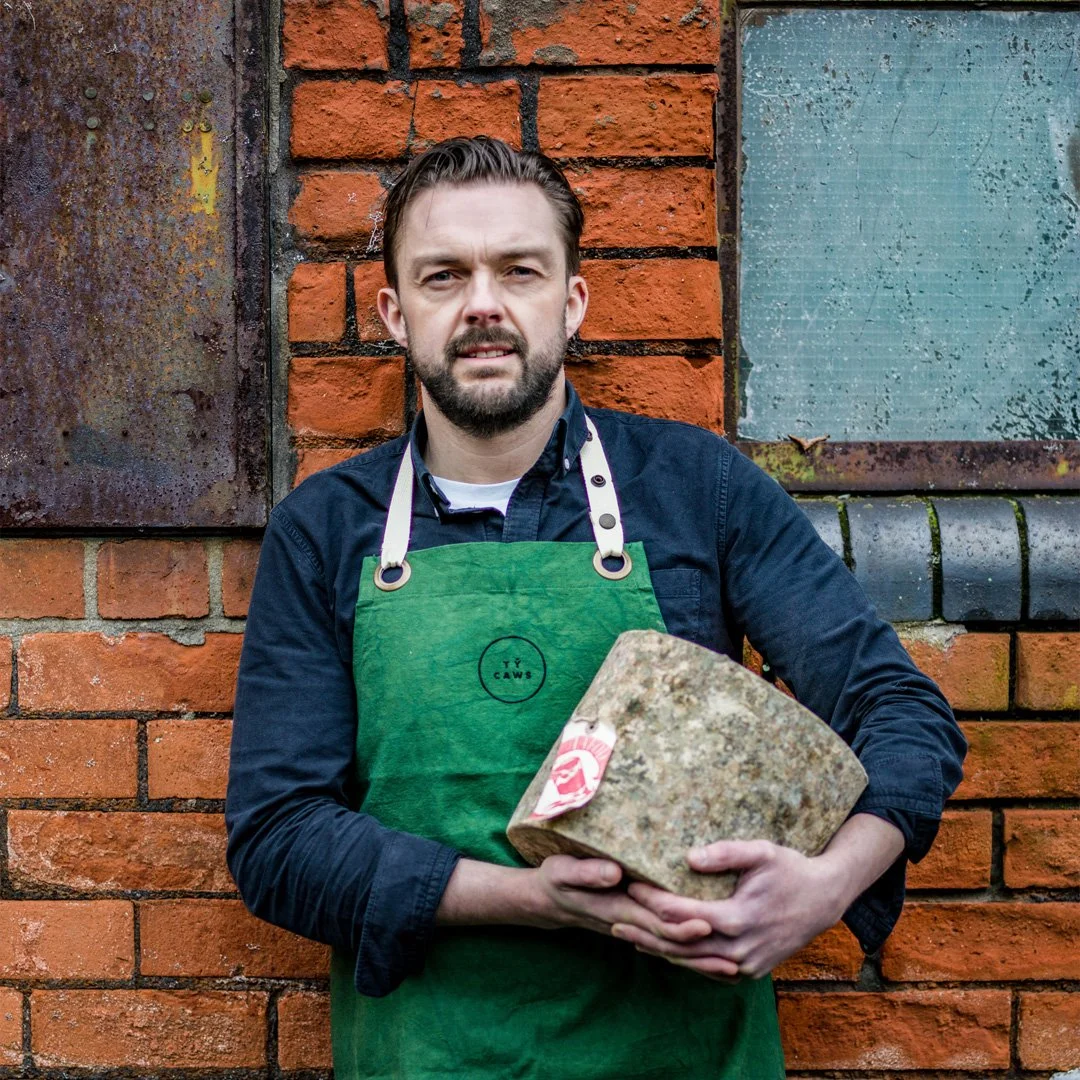
Let's break it down properly.
The logo
This is where most people start. The logo is the most visible expression of a brand. It's the mark that goes on your packaging, your website, your signage, your social media and your email signature. It's the thing people recognise from a distance.
But a logo is just a symbol. It has no meaning on its own, it borrows meaning from everything around it. The Nike swoosh only means what it means because of decades of product quality, athlete partnerships and marketing. On its own, it's a tick. The meaning comes from the brand, not the logo.
Which is why starting with just a logo, and only a logo, so often feels unsatisfying. The logo looks fine. But it doesn't feel like anything yet. That's because it hasn't been given a system to live in.
Typography
The typefaces a brand uses are doing more work than most people realise. Type communicates personality before a single word is read. A serif font feels established, considered and traditional. A geometric sans-serif feels modern, clean and confident. A hand-drawn script feels warm, personal and craft-focused.
A good brand identity typically includes two or three typefaces with clear rules for how they're used, a headline font, a body font, and sometimes a third for accent use. Consistency in how type is used is what gives a brand its visual rhythm.
Colour palette
Colour is one of the most powerful tools in brand design. It's also the one most often chosen on the basis of personal preference rather than strategic thinking. "I like green" is not a brand strategy.
The questions worth asking are: What does this colour communicate? What does it say in the context of our industry? How does it compare to what our competitors are doing? A brand colour palette, usually two to four colours, with clear guidance on how they're used together, is a foundational part of any identity system.
Imagery and photography style
How a brand uses images is as much a part of its identity as the logo. Think about the difference between the imagery in a Patagonia campaign and a Zara campaign. Both are clothing companies. The visual language is completely different, and that difference is doing huge amounts of brand work.
A brand identity should include guidance on the kind of photography and imagery that fits. What subjects, what mood, what lighting and what composition? Even if you're a small business producing your own social content on a phone, having a clear sense of your visual style makes everything feel more coherent.
The supporting graphic language
Most brands need more than a logo, some type and a colour or two. They need a wider kit of parts that fills the space around the main elements. This is the graphic language: patterns, icons, shapes, borders, textures and any recurring visual device that shows up across the brand.
It's the part people rarely ask for by name, but it's often what makes a brand feel finished rather than bare. A logo sitting alone on a white page looks like a logo. The same logo with a supporting pattern behind it, a set of icons that match its line weight, and a shape language that carries through the packaging and the social posts starts to look like a world.
Think of it as everything that isn't the logo but still unmistakably belongs to the brand. Get it right and you can strip the name off a poster and people still know whose it is.
Icons
Icons matter more the more a brand has to explain. A menu, a set of services, a product range or a process. Custom icons drawn in the same style as the logo keep all of that consistent and stop you reaching for generic clip art that belongs to no one.
The key word is custom. A downloaded icon set does a job, but it's the same job it's doing for a thousand other businesses. Icons drawn to match your line weight, your corners, your level of detail become part of the brand rather than a borrowed part sitting on top of it. They're small, but they're seen constantly and small things repeated often are exactly what a brand is made of.
Tone of voice
This is the one that gets left out most often. Tone of voice is how a brand sounds in words, the personality that comes through in captions, website copy, email subject lines and anywhere else the brand communicates in language.
Is it formal or casual? Direct or fluffy? Dry and witty or warm and encouraging? These aren't arbitrary choices, they should reflect the actual personality of the business and the people running it. Tone of voice guidance doesn't have to be long. Sometimes a few example phrases, "we'd say this, not that” is enough to give a team something to work with.
Brand guidelines
All of the above is useful. But without documentation, it slowly falls apart. Brand guidelines, sometimes called a brand book, are the rulebook that holds a brand identity together over time. They explain how every element should be used, in which contexts and why.
They're especially important when other people need to use the brand: a social media manager, a printer, a new member of staff or a web developer. Good brand guidelines mean the brand stays consistent whether you're the one applying it or not.
So what do you actually need?
It depends on where you are. If you're just starting out, a stripped-back identity, logo, colour palette, typography, and a few key guidelines, is usually enough to get moving. The brand can grow as the business does.
If you've been operating for a while and things feel inconsistent, a brand alignment project can pull together what already exists and create coherence without starting from scratch.
If you're ready to go further, to really define who you are and how you want to be seen, then a full brand redesign, including strategy, workshop, and a complete identity system, is the right approach.
The best place to start is a conversation. Not a brief, not a budget, just a chat about where you are and where you want to get to. If you'd like to have that conversation, get in touch.